HP’s New Touch-pads Suck
I was setting up some brand new HP Probook’s today (typically VERY nice machines in my experience) when I was suddenly rendered crippled by a IMPOSSIBLE to use touch-pad. What a DREADFUL piece of shit this new design is.
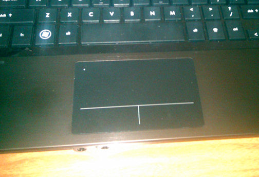
Basically, the touch-pad and buttons are all one surface.
Observe:
The problem comes from the fact that the “button area” is still part of the touch-pad. So you place one finger on the button, and now you can’t use the fucking touch-pad. Your cursor will either sit there and stare at you like a vegetable or it’ll jump all around the screen like crazy. Either way, the touch-pad is completely unusable if you’re touching either button. This is incredibly frustrating because my style of laptop mousing is resting one hand’s fingers on the buttons while using the other hand to navigate the mouse, or resting one finger on the button, while the other navigates the mouse for faster mouse action. The only effective way to use this touch pad is with one hand and one finger. Christ. It’s awful. Seriously.
I ended up grabbing one of those USB ball mice and plugging the damn thing in and using that, because trying to use that bloody touch-pad was making me want to kick puppies. And I love puppies.
Thanks for the SHIT design HP. I’m sure as hell glad this isn’t my machine. I would be returning it if I had to put up with that damn thing.

Brandon
What a crap-ass awful design!
I wish more laptop/netbook makers would get it together with the two finger scrolling. Every PC implementation I’ve seen of it, so far, has been pretty awful. Touch pads in general are still way too small. I still use the IBM/Lenovo eraser head on my work laptop.
– B