Why is Windows 7 Media Player So Ugly?
I’ve been using Windows 7 for a few weeks now, and it’s alright I guess. It would’ve more appropriately been named Windows Vista SE (Second Edition) though. It does not feel like a new OS. It feels like Vista SE.
While a lot of changes are good, there are some changes that just make me go “WTF?”
One such WTF change is the new Windows Media Player. It’s freaking BUTT UGLY in Windows 7. I mean it looks like Microsoft just completely forgot to develop any kind of skin for it. I am completely dumbfounded by this.
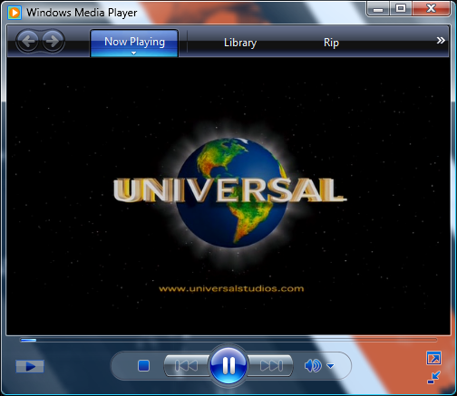
First, lets look at Windows Media Player in Vista…
Nice pretty transparencies, a nice defined playback window.
Now lets look at Windows Media Player in Windows 7…
Hence my WTF?!? The title bar of the program is completely void of text for some unknown reason, and the whole thing is just flat black. The blurry line at the top is the name of the file playing, I blurred it out for the screen shot. As I said it seriously just looks like Microsoft forgot to skin the damn thing. What happened to the nice smooth transparencies from Vista?
In fact, so many people dislike the new media player, there are instructions and a download to install the old media player from Vista on to Windows 7. I think I’ll skip that because I don’t want to mess up any future media player updates, but I must admit it is tempting to not have to look at this ugly beast every time I play a video file.
Damn you Microsoft… you just can’t get everything right on one shot, can you? I can’t even fathom who saw this change, and gave it the stamp of approval. It looks like garbage.


KrAzE
It looks alot like the corporate skin.. ew.